
Dunkin’ Donuts App Redesign
Skills: Visual Research, Design Thinking, User Testing, Sketching, Wire Framing, Prototyping, Illustration
Tools: Figma, Adobe Illustrator, Adobe InDesign, Adobe Photoshop
Timeline: 2023
The Problem
The Dunkin’ Mobile App’s purpose is to expedite the process of ordering food. However, in its current state, the app lacks crucial information regarding an order after it has been processed into Dunkin’s system. This including order progress, estimated time of completion, and reminders of what items were ordered, hurting a customer’s overall experience using the software.
Research
The purpose of this project is to identify pain points within this app in order to see what areas Dunkin’ can improve on to create a better overall user experience. To achieve this, features will have to be added and adjusted – and thoroughly tested with users – which resolve said issues.
As a part of my research, I used the Dunkin’ app in its current state and compared it to competitors. I also talked with real users to see what they wanted improved. Reviews in app stores were another great place to find some of this information.

Objectives
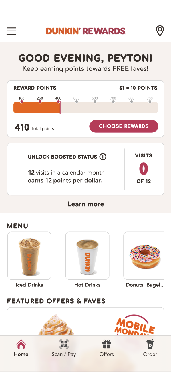
After some investigation, the main problems identified were in how the app handles orders after they have been placed. Customers are provided with a receipt which provides some basic information. However, when this is closed, it can’t be accessed again. In addition, there are no indicators on the orders progress to be found, which many competitors do include.
With all of this in mind, I set out with the following goals:
Add a “progress” button that appears on the home page after an order,
Create a new page showing necessary information about progress,
Condense information throughout the app that is not immediately necessary.
Sketching and Wireframing
To properly flesh out the goals for this project, it was important to begin sketching and wireframing the app. This process is necessary as it allow for my ideas to be fully fleshed out before going on to the computer to implement the ideas. Below are some of my initial sketches and wireframes.
With each iteration of wireframe, the idea became more centralized, and the sketches were cleaner. Consultation with peers and users during this process allowed for meaningful insight as I went along in order to direct my results.

Designing and Prototyping
After having a fully realized idea of what needed to be done, I made my way to Figma in order to begin implementing my solutions.
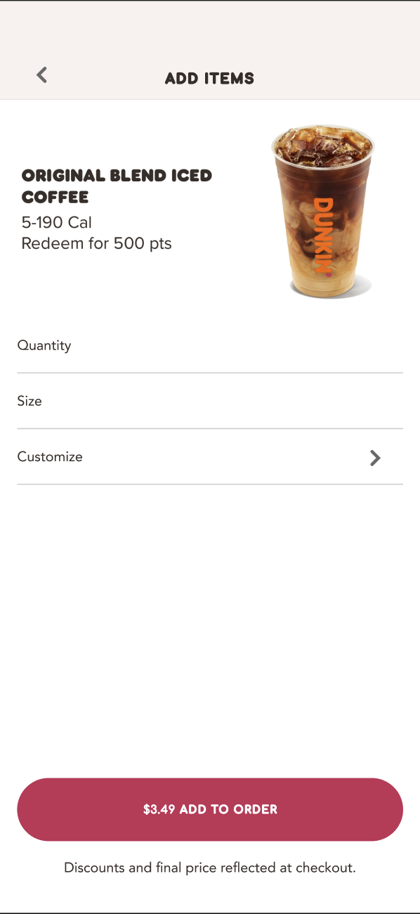
This process began by recreating the existing Dunkin’ app page-by-page in order to have a working replica to add my solution to. This process was somewhat time consuming, but incredibly necessary to properly test my implementations and new user flows effectively.
After this, I implemented a rough version of my new features. This would allow me to get initial user feedback in order to further refine the design. The original implementation can be seen below.


User Testing
Four users within the target audience were selected to test the prototyped features added to the Dunkin’ app. Users were asked to:
Go through the process of ordering an item,
Locating the new “order progress” button and page,
View the available information and point out anything they feel they are missing or any other pain points.

Insights
After the completion of the testing, there were a couple concerns that arose:
Design – the button on the home page and the new created page needed to be refined and cleaned up. Although this was just a first version of this redesign, it is important to note that a more intense interface design process would be necessary to get it ready,
Information – the users wanted certain bits of information condensed and others more immediately clear. For example, one user wanted a reminder or note of which location they had ordered to. Another just wanted to see their original receipt from the order.

Redesigning
The final redesign of the app includes a few quality-of-life changes. The most major of those is the addition of the “order progress” button seen at the bottom of the home page after ordering. This button leads to a page which includes any and all information a customer may desire after ordering from Dunkin’ making the experience of ordering from the app all the more efficient.
Conclusion
For my first-time implementing features into an app there were a few key insights I would note for next time:
Research is an incredibly important process when adding features to an app. It is crucial to note what competitors are doing and make decisions in response,
User testing is really the heart and soul of this whole process. We have to design with people in mind – this is a must. User testing allows us to hear directly from the people we are working to help.
User experience and seamless integration is a must. If people hate the look and feel of an app, they are less likely to use it often.
