A beginner’s guide to content analysis
When creating a strategy around the content of a brand or organization, it’s important to first take a look at what they already have. After all, you wouldn’t rebuild an entire house if you were just looking to remodel a bathroom.
The process of examining and analyzing a brands current strategy to see what needs to be changed or improved is called content analysis. It is a crucial first step to any strategic planning process because it allows us to understand if an organization is meeting their goals and if they are satisfying their users.
The Brand
The first step of this process is to know and understand your brand. Let’s look at American Forests as an example.
American Forests is a nonprofit organization focused on creating healthy forests across the United States. They do so by innovating in the forestry space, partnering with organizations in different areas to plant and restore forests, and creating a movement to protect forests. American forests envision a world in which people realize the societal and economic benefits that forests bring and that they have equitable access to them.
It is also important to understand who the brand is trying to target with their content. In American Forests’ case, they have very a broad audience. It starts with individuals who care for the environment. The organization is always looking for people to support their cause by advocating for forests to congress and the public as well as donating to the cause. Additionally, they are always looking for corporate partners who will back them and allow them to make greater change.
Search Engine Optimization
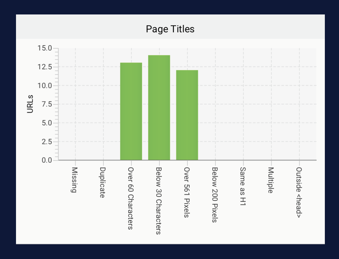
Now let’s take a look at their content. A good place to start is by breaking down the search engine optimization (SEO) strategy and quality on the site. Using a tool by Screaming Frog, we can get a full overview of the different SEO components across a website. For this scenario, I will be looking into page titles, meta descriptions, the use of HTML header elements, and alt tags.
Accessibility
Taking insights from Screaming Frog and combining them with information from WAVE, a website accessibility evaluation tool, we can get a good idea about how people with certain disabilities are going to be able to interact with the site.
When it comes to understanding how users interact with a website, we also have to look at the architecture of the site. How is the website organized, and is the navigation easy to use?
Social Media & Written Content
The last step of this process will be to look at and analyze the actual content the organization is uploaded. This includes written content on their website and social media content across all channels. We’re looking to see the quality of the work and if it is optimized for the audience that the organization is trying to target. We also want to see if website content is optimized for users to skim the website and get information quickly.
Conclusion
Through my analysis of American Forests’ website, I found that there are a few ways they can improve it to make it easier to navigate and more accessible.
Successes:
Descriptive titles and headings
Great social media content
Positive and uplifting writing and voice
Opportunities:
More accessibility features as a whole
Add proper alt text to all images
Add descriptive and concise meta descriptions to all pages
Condense navigation
For one thing, these changes will better optimize the website for searchability on the web. Moreover, they will create a better user experience on the website, which will allow them to better present their worthy cause to a larger audience.
To view my full content analysis of American Forests, you can click the button at the top or bottom of this blog.
Hi! My name is Peyton McKenzie.
I am a professional graphic designer, photographer and content creator.
I encourage you to explore my portfolio to get a better idea of the work I create. If you are interested in working with me or have inquiries of any kind, don’t hesitate to reach out over email.


